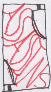
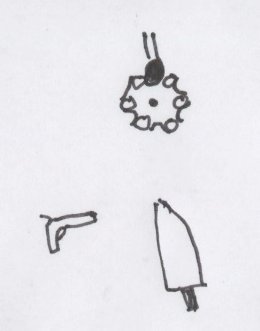
Perspective:
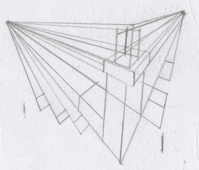
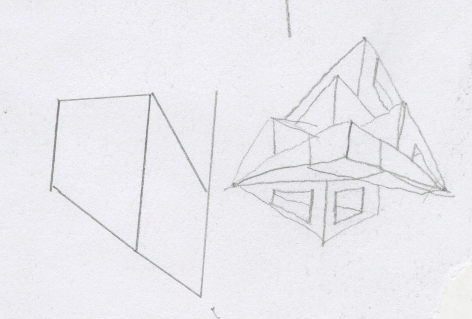
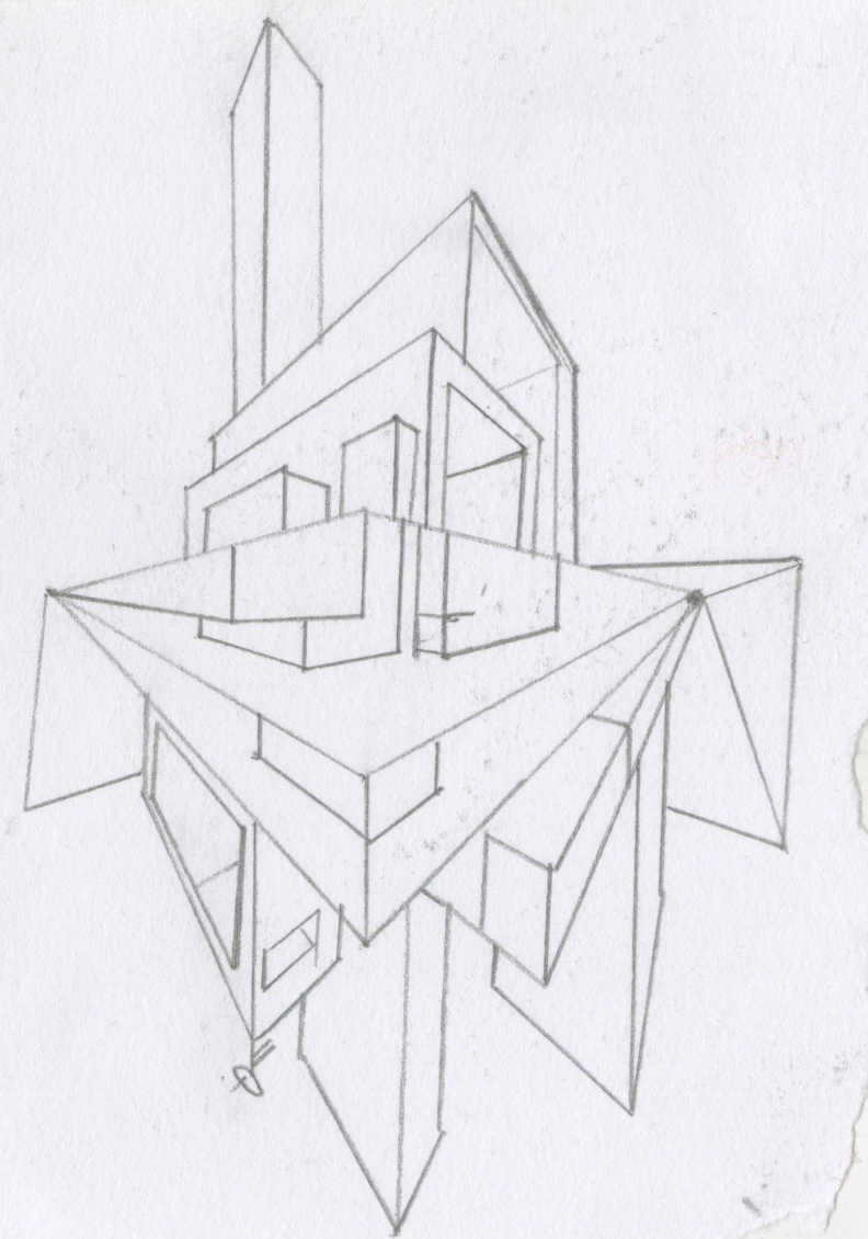
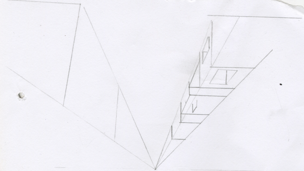
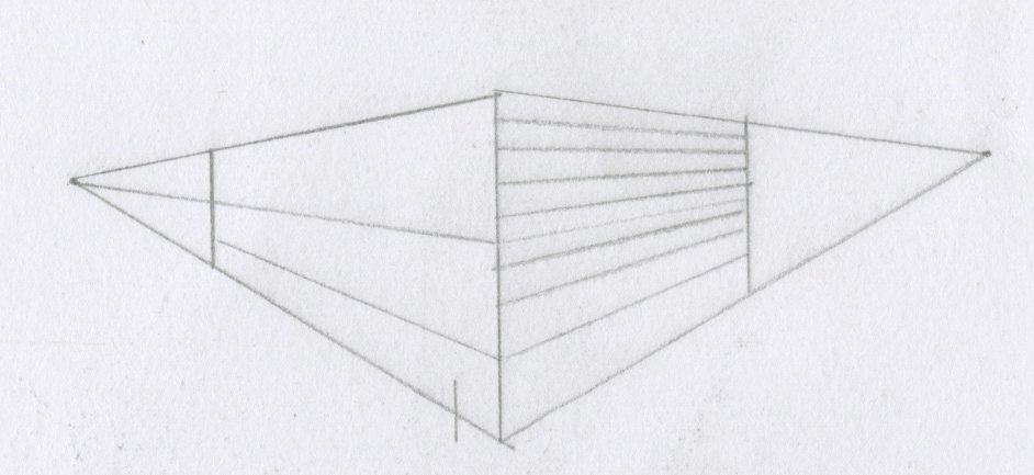
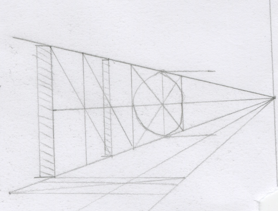
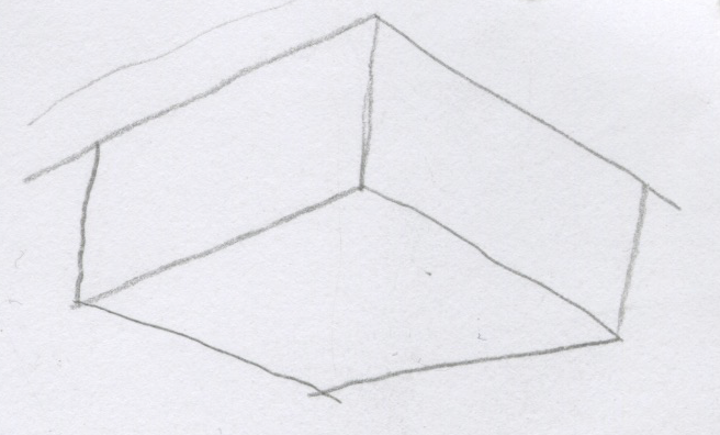
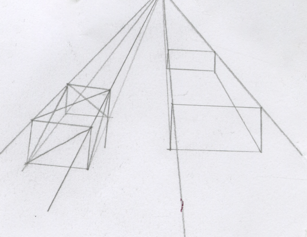
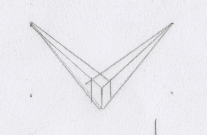
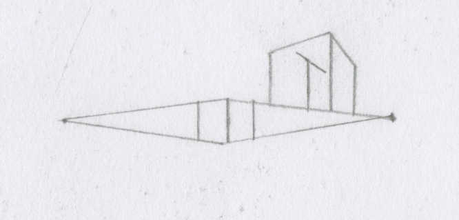
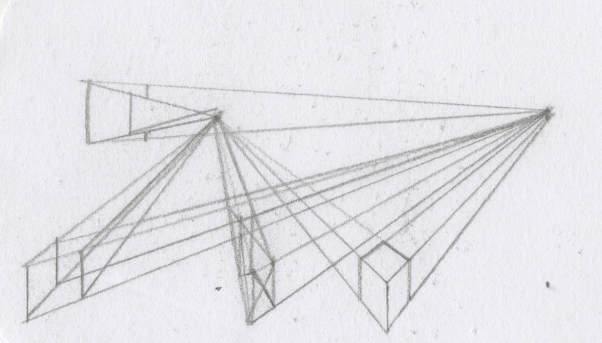
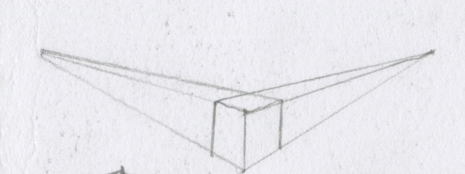
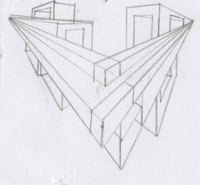
Heres me trying to wrap my head around 2 point perspective. Even post this project i am still trying to do perspective in my sketchbooks as i feel its one of my weaker abilites.
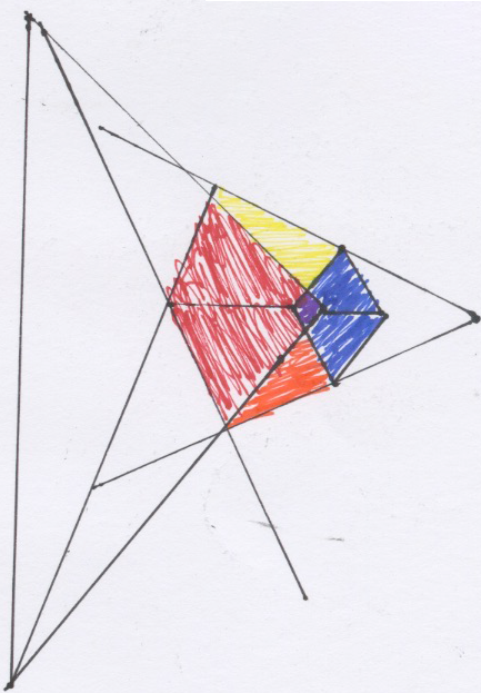
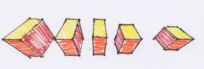
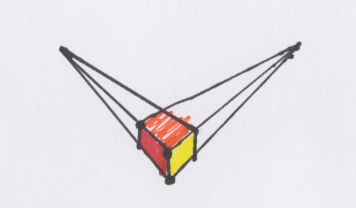
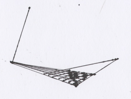
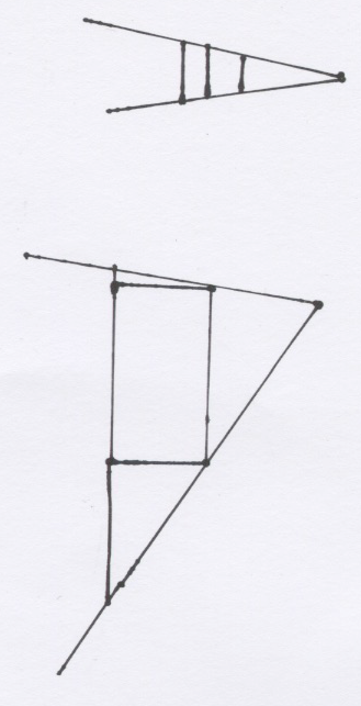
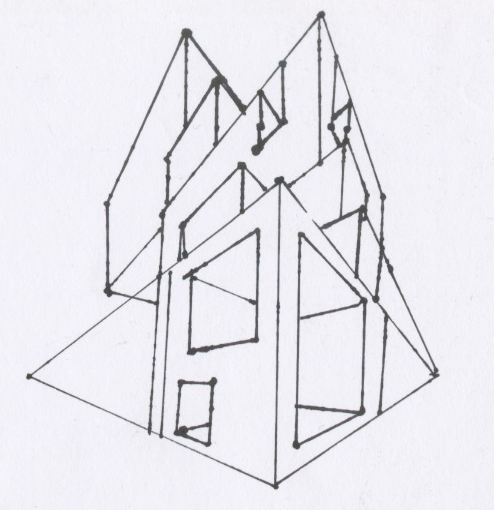
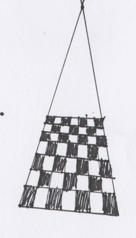
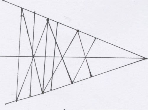
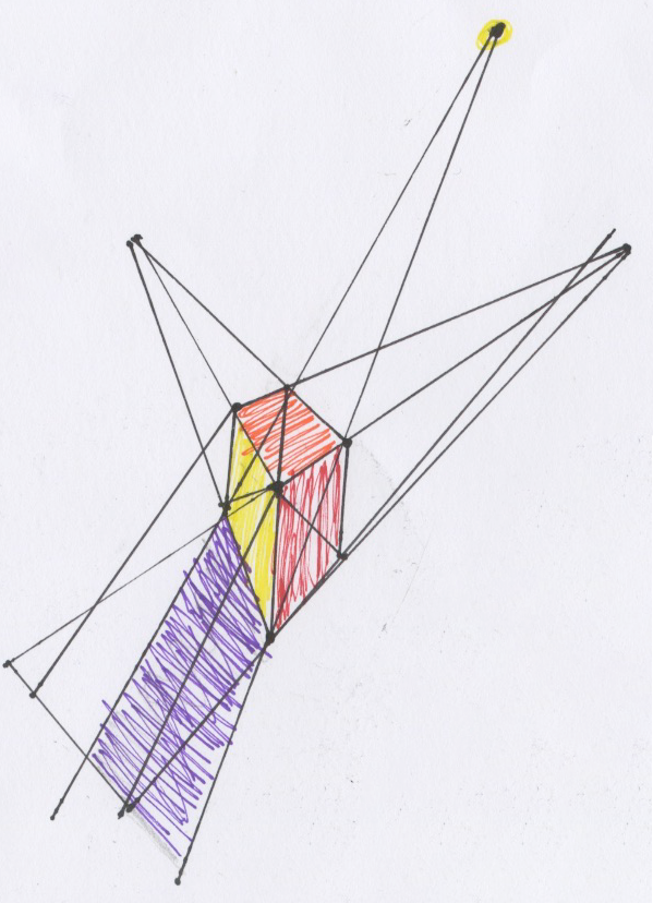
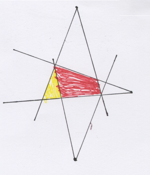
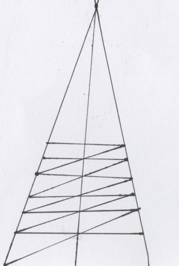
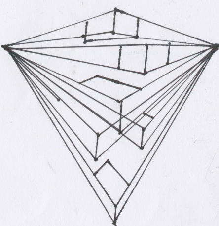
ive played with a alot of 1 point 2 point and even 3 point perspective with shadows and colors to try and guage my own abilites with it and develop it into a usefull skill for the future.
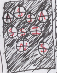
Typography:
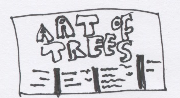
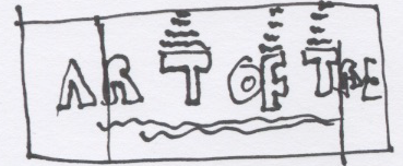
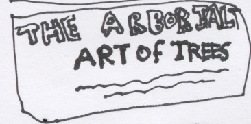
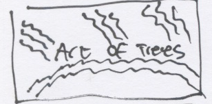
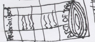
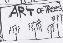
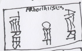
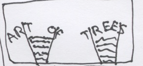
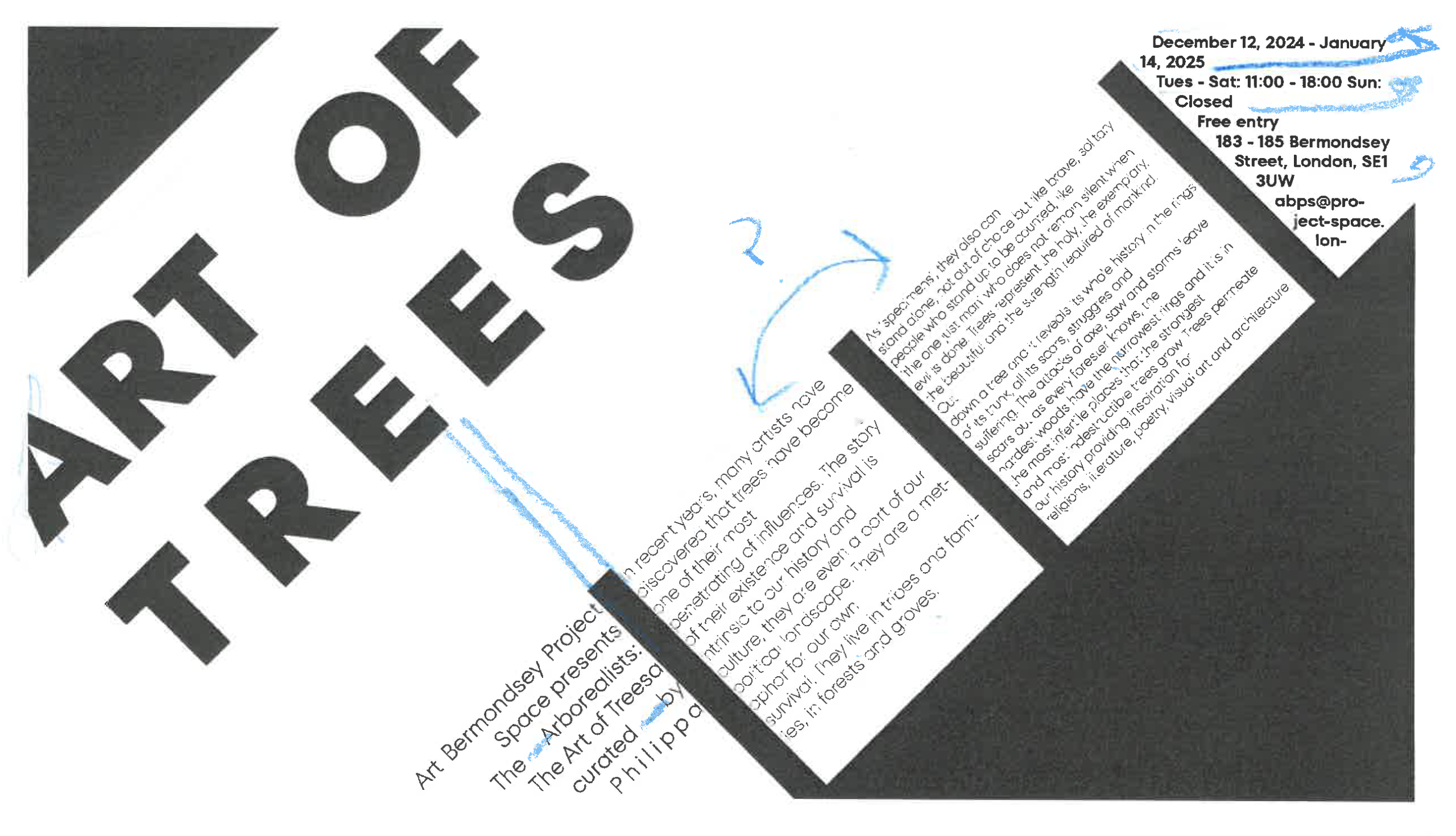
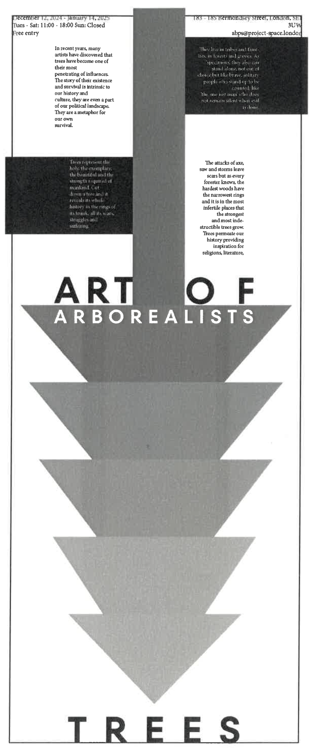
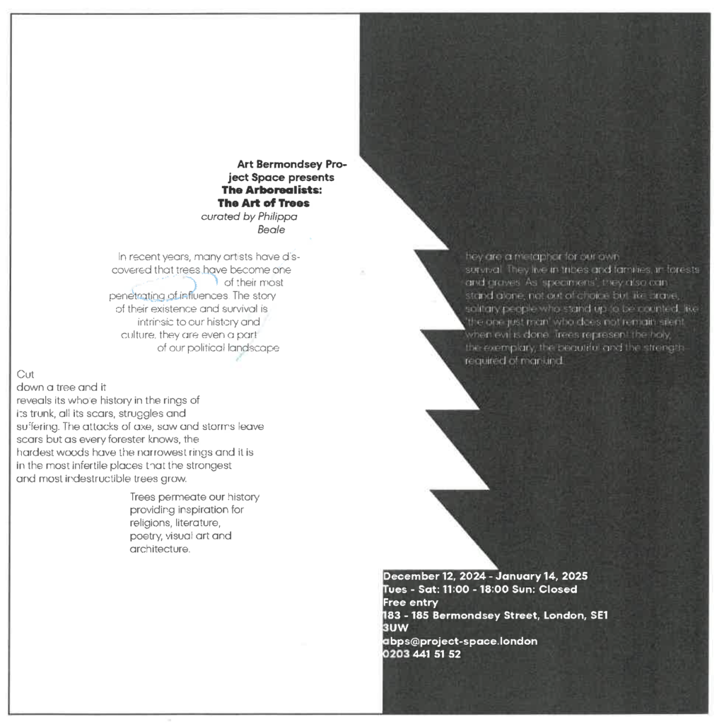
For this project i was givin The Arborialists Art of Trees, which led me to try and encorperate trees into my design process.
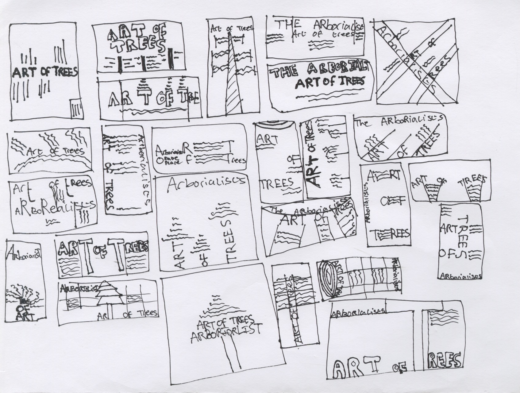
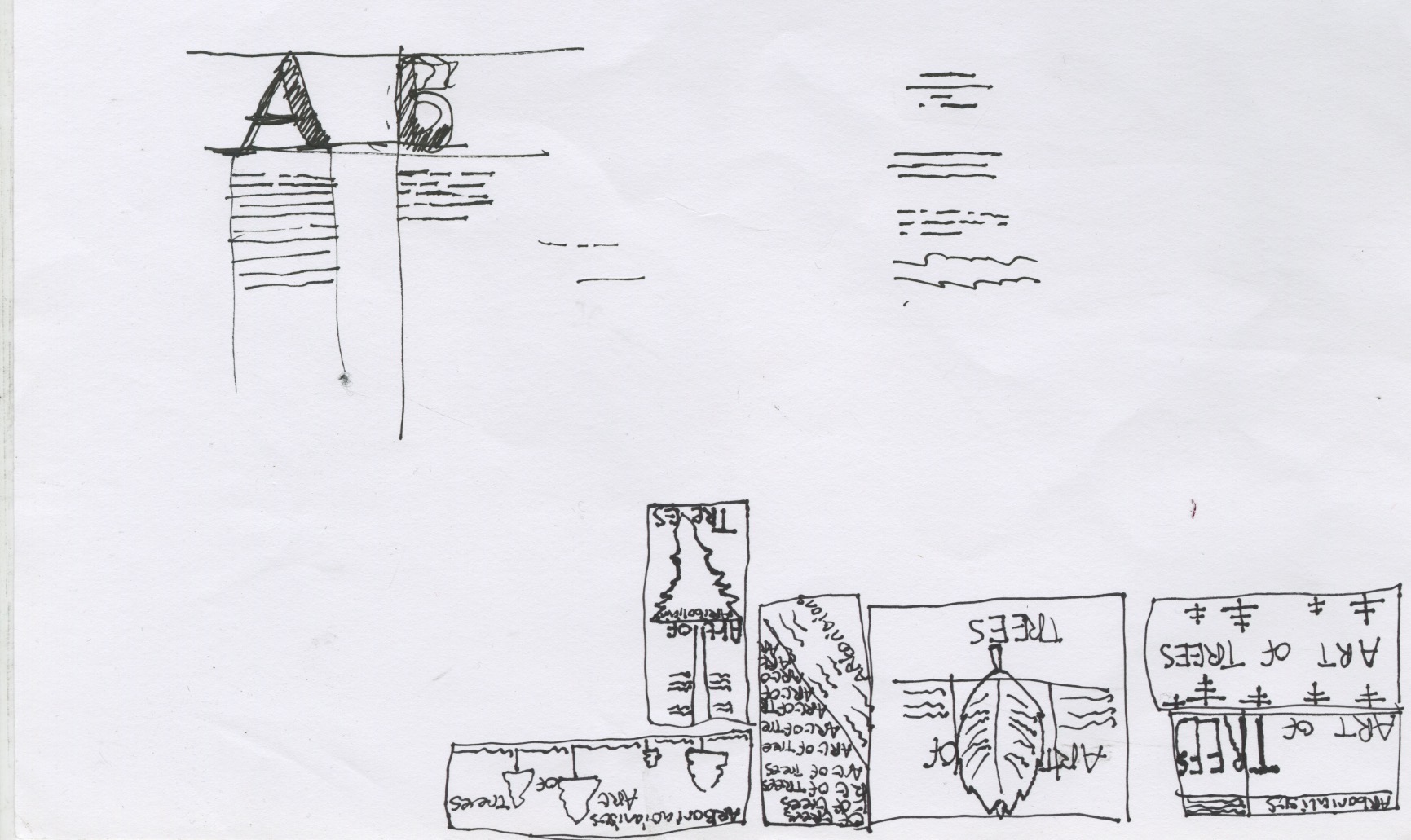
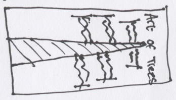
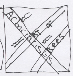
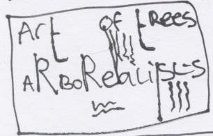
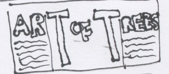
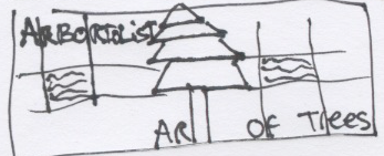
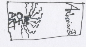
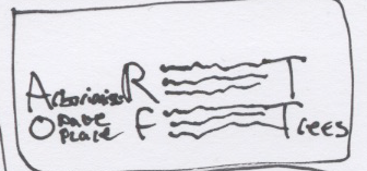
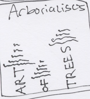
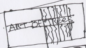
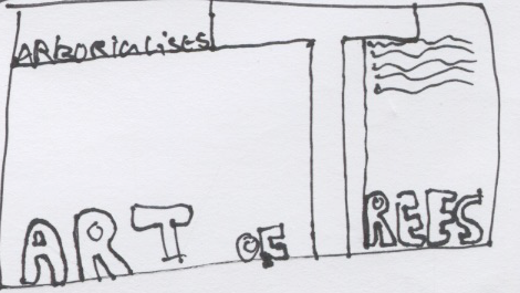
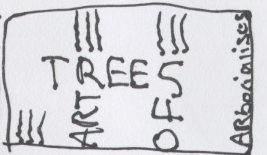
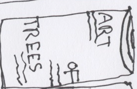
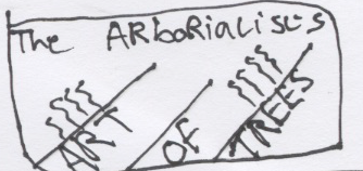
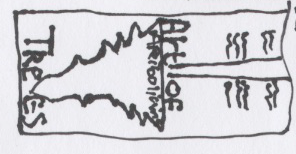
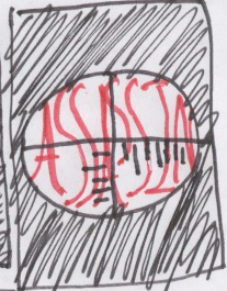
After creating designs in Indesign we where givin formative feedback on the designs and could be improved on them. my typo was disimilar of the first one, The tree being upside down literaly didnt sit right and the text was unreadable due to being white on such a thin typeface.
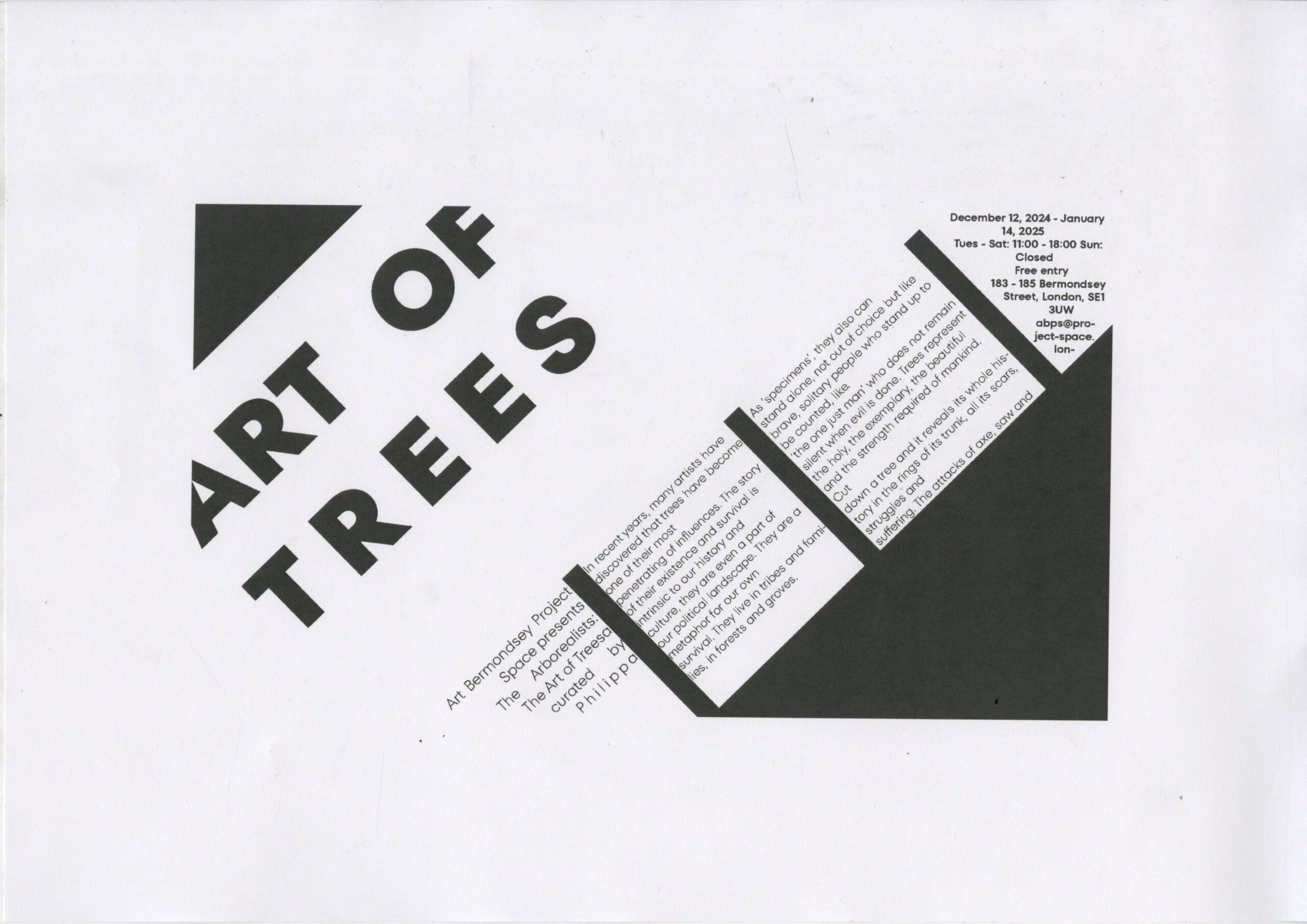
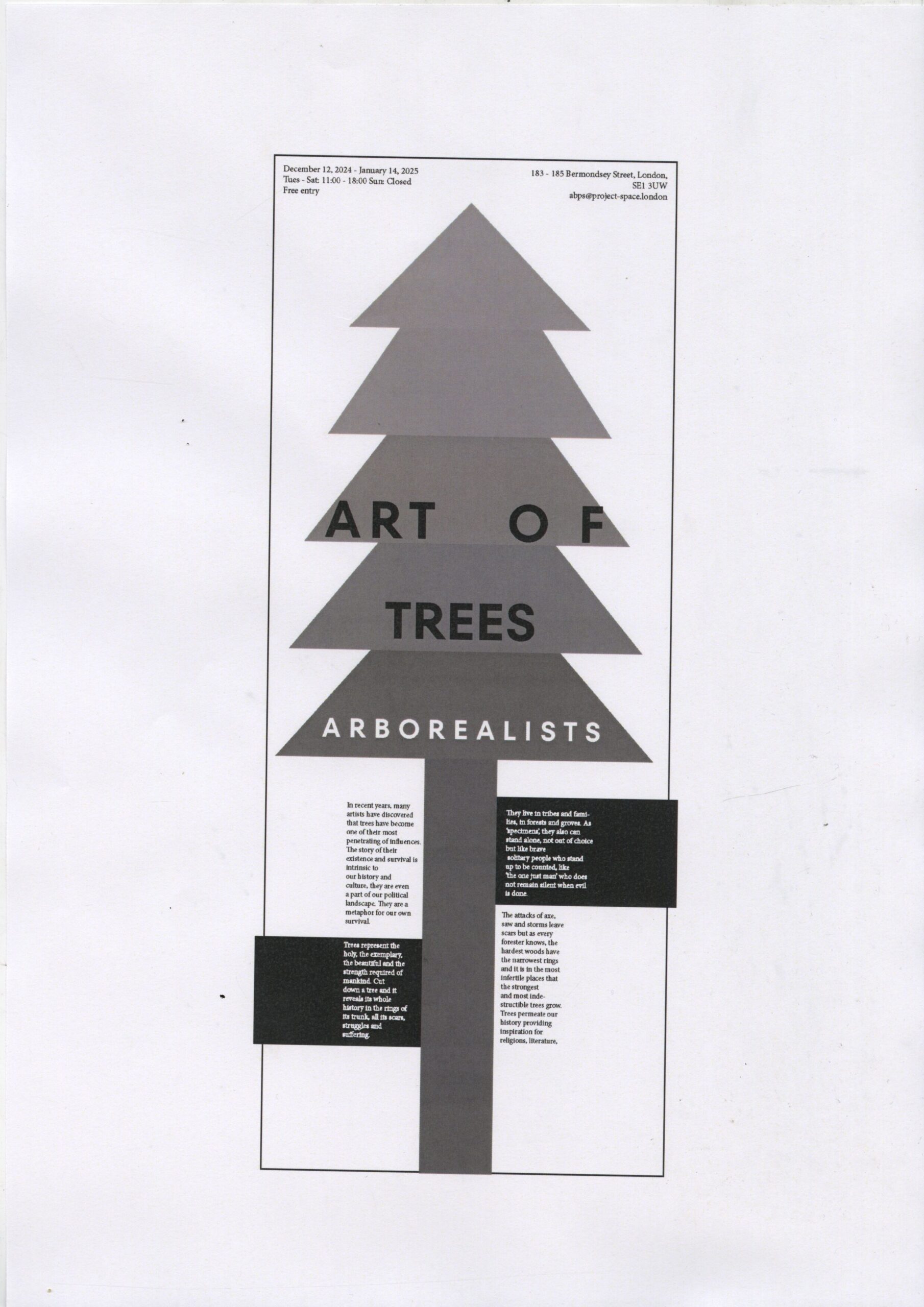
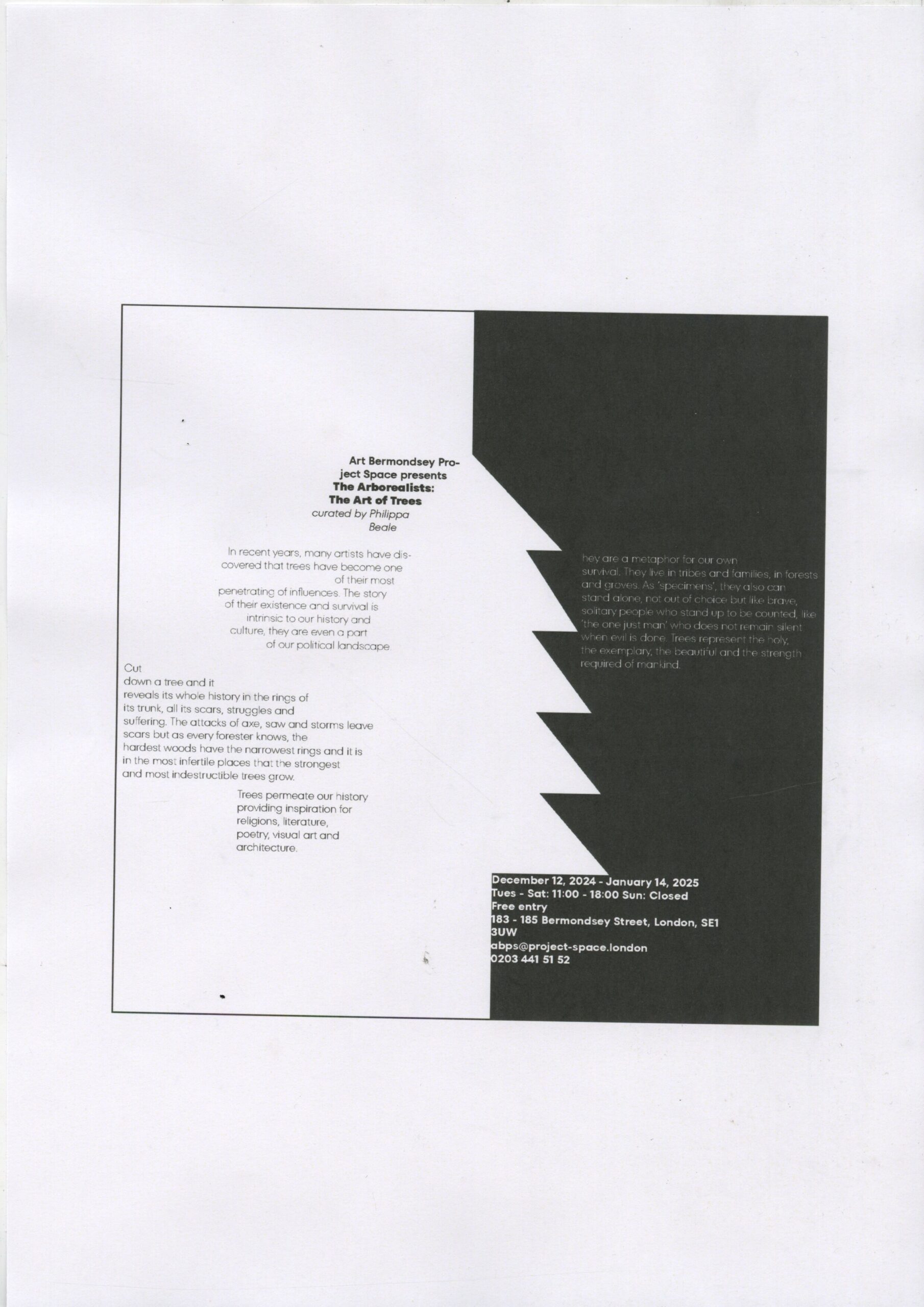
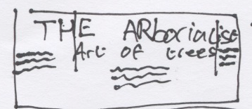
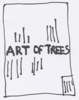
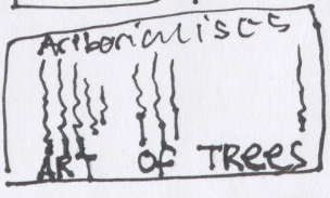
After the formative i fixed the images by matching typeface sizes, fixing dates and locations, turning the tree upright and using thicker line weights on white type ontop of black backgrounds to allow them to be readable.
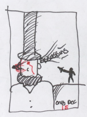
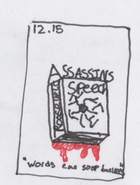
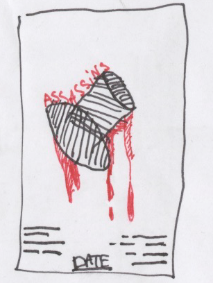
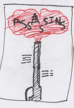
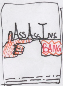
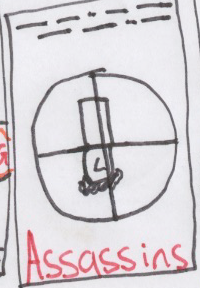
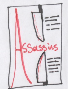
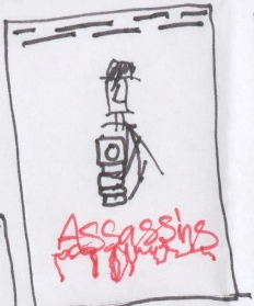
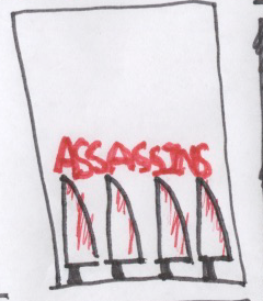
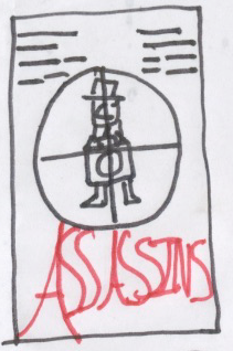
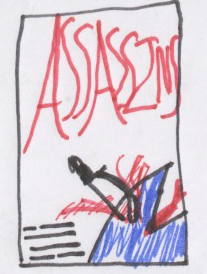
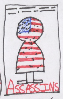
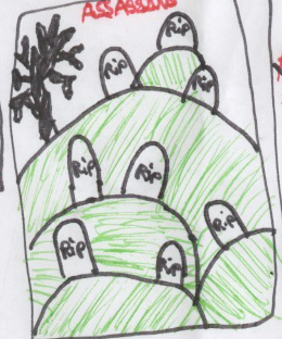
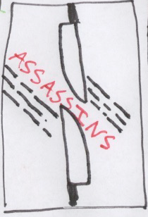
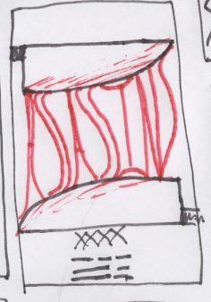
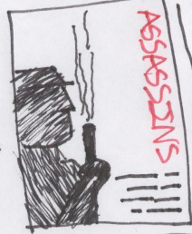
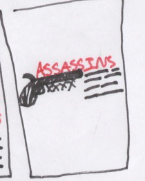
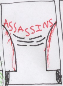
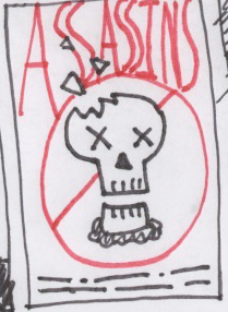
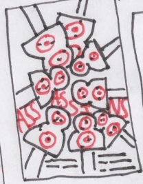
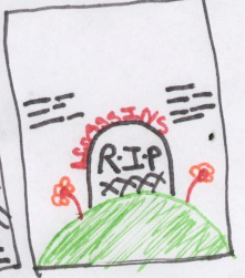
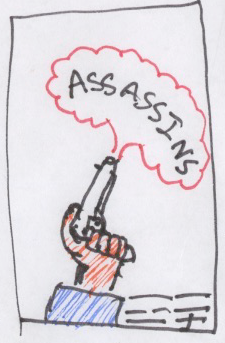
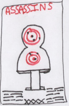
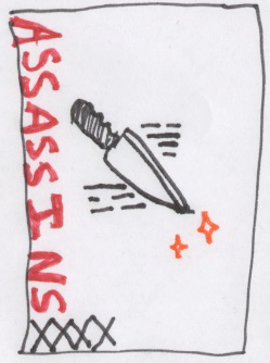
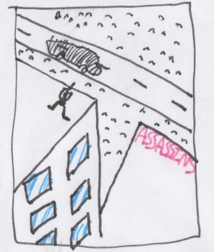
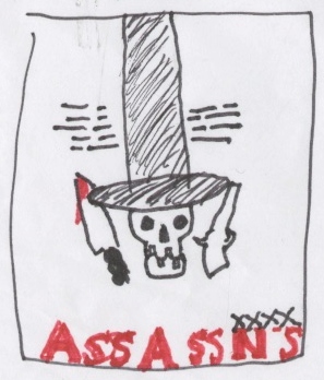
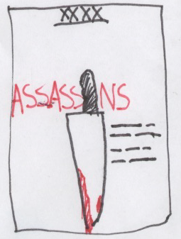
Thumbnail visuals:
for this brief we just had to make thumbnails for the play of our choice within the brief. I chose assasins as i was drawn to the morbid comedic themes of it.
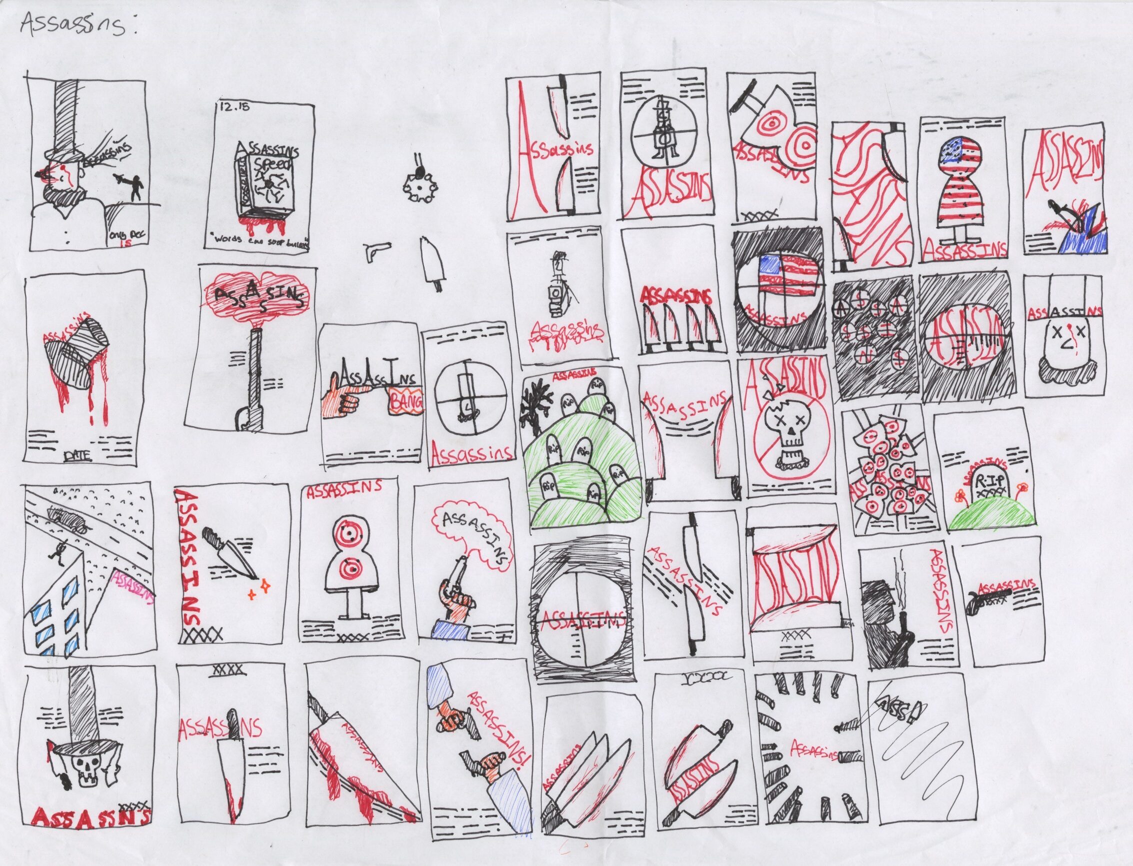
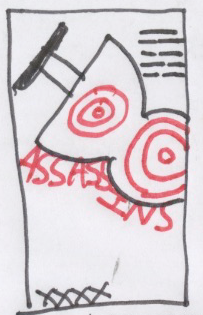
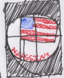
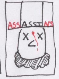
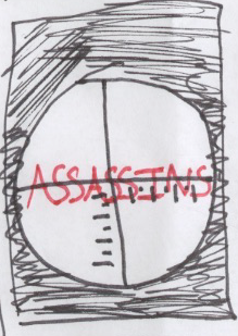
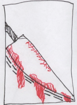
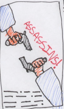
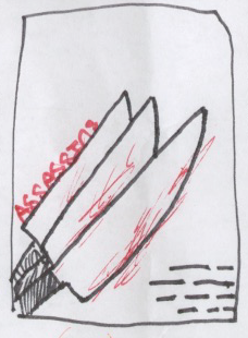
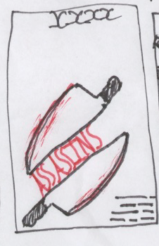
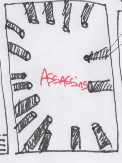
Reflecting on this project overall i have found that my ability to create thumbnails is lacking greatly as its somthing no matter how hard i try i cant seem to get done fast. I spent hours and hours on what feels like just a handful of thumbnails. This is somthing i will continue to practice on and get better at in the future.